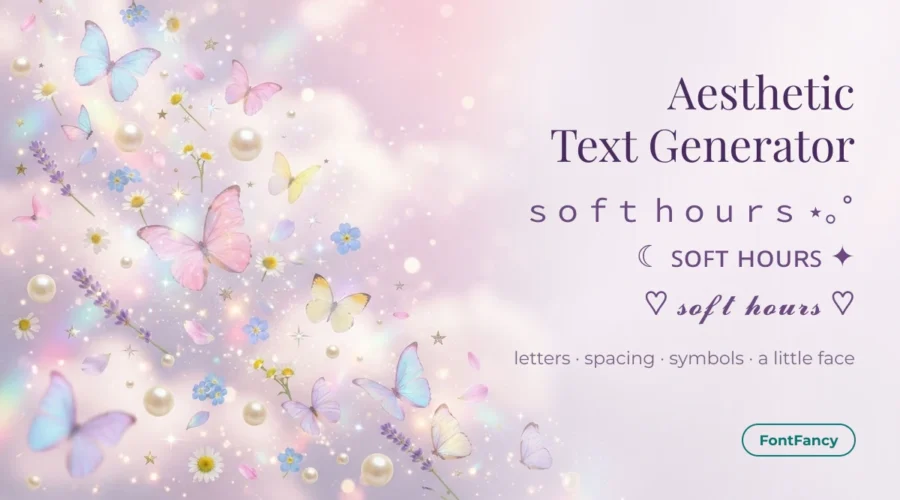
An aesthetic text generator turns plain words into soft Unicode styles — ꜱᴍᴀʟʟ ᴄᴀᴘꜱ, 𝓼𝓬𝓻𝓲𝓹𝓽 or fullwidth — that you finish with symbols and a kaomoji. Type above, copy a style, then add one of the ready recipes below for an Instagram bio, a TikTok name or a caption.
The box at the top is the FontFancy generator, opened on the ten styles people reach for when they want something soft. The rest of this page is the part a generator cannot do for you: which letters, symbols and faces belong together for each look.
What makes text look aesthetic
Text looks “aesthetic” when four small choices agree with each other: a letter style, the spacing, a few soft symbols and, often, a face. No single font does it on its own — 𝓼𝓸𝓯𝓽 in script next to a skull emoji reads as a joke, not a mood.
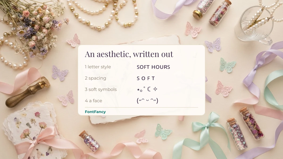
- Letter style sets the voice: small caps is neat, script is romantic, fullwidth is retro.
- Spacing slows the reader down — a space between letters or a blank line between phrases.
- Symbols set the setting: clouds, bows, mushrooms, stars.
- A face adds feeling at the end of the line, and should match the rest.
Seven looks side by side
Each row is a complete combination you can rebuild in under a minute. Pick the look first, then take the letter style from the tool at the top and the symbols from the sections below.
| Look | Letters | Symbols | Face | Sample line | Suits |
|---|---|---|---|---|---|
| Fairycore | Script or bold script, lowercase | 𐀔 ʚïɞ 🍄 🌿 ✧ | ଘ(੭ˊᵕˋ)੭ | 𓂃 pressing flowers ✧ | Nature, craft and slow-living accounts |
| Cottagecore | Italic serif or small caps | 🌼 🧺 ✿ 𓍢ִ໋🌷 | (˶ᵔ ᵕ ᵔ˶) | 🌼 bread, books & sunlight | Baking, gardening, reading |
| Coquette | Script with small caps accents | ୨ৎ 𐙚 🎀 ♡ | ⸜(。˃ ᵕ ˂)⸝♡ | ୨ৎ pretty little things | Fashion, ballet, beauty |
| Y2K | Fullwidth, bold sans or monospace | ★ ⟡ 🎧 ✮ ♪ | ( • ̀ω•́ )✧ | ⋆˙⟡ online | Music, gaming, playlists |
| Dreamy / cloud | Script or italic, lots of space | ☁︎ ☾ ⋆。°✩ | (っ˕ -。) | ☁︎ head in the clouds | Night posts, poetry, calm pages |
| Kawaii | Small caps or fullwidth | ʚɞ ♡⸝⸝ 🍓 🍰 | ₍ᐢ. ̫.ᐢ₎ | ʚ snacks & naps ɞ | Food, pets, stationery |
| Vintage / study | Italic serif or fraktur for one word | 📜 ❦ 🪶 🎻 | none — keep it quiet | 📜 old letters, new stories | Books, film, study accounts |
Copy a look: symbols, names and bios
Every group below has three parts: the symbols that define the look, three names already styled in it, and two bio lines you can paste as they are. Multi-line bios keep their line break when you paste them into Instagram or TikTok.
Fairycore (30)
Fairycore borrows from folk tales: wings, mushrooms, moss and small glints of light. A May 2026 trend piece in NSSG Club called summer 2026 a “fairycore summer” and listed exactly those motifs — lace, glitter, wildflowers, mushrooms and butterflies. In text, the butterfly ʚïɞ and the Linear B-style mark 𐀔 do most of the work.
Cottagecore (34)
Cottagecore is quieter than fairycore: the same countryside mood without the magic. Italic serif reads like handwriting on a recipe card, and the flower and basket symbols carry the rest, so the letters themselves can stay simple.
Coquette (24)
Coquette is built around ribbons — ୨ৎ and 𐙚 are the text-only bows people use — with script letters and one soft emoji. It has been popular long enough that plain bows look familiar, so pair them with something personal rather than stacking three in a row.
Y2K (20)
Y2K text looks like early-2000s screens: wide letters, stars, music notes and a little chrome shine. Fullwidth and monospace suit it because both look typed rather than handwritten. For rounder, sticker-like letters, bubble text fits the same mood.
Dreamy and cloudy (35)
The dreamy look is mostly about space. Clouds and moons sit at the ends of a line, the letters are thin, and nothing is bold. It works best when you use fewer symbols than you think you need.
Kawaii (33)
Kawaii leans on faces and food: bunny ears ᐢ ᐢ, cat whiskers, strawberries and cake. Small caps keeps the letters tidy so the faces get the attention.
Vintage and study (23)
The vintage or study look avoids faces and bright emoji entirely. One fraktur or italic word, a scroll or a quill, and a lot of plain text read as calm and bookish.
Kaomoji that finish a soft line
Put a face at the end of a line, never in the middle of a name. These are gentle ones — happy, shy and sleepy — that suit every look above except vintage.
Wide letters, briefly
Fullwidth letters such as soft hours come from the Halfwidth and Fullwidth Forms block and give the spaced-out “vaporwave” look without typing spaces. They take a lot of room, so use them for one or two words. We cover the whole wide style, with spacing tricks, on the wide text generator page.
Dividers and line breaks in a bio
A bio looks aesthetic when each line has one job. Put your name or tagline on the first line, what you post about on the second, and a divider or link cue on the last. Instagram keeps line breaks you paste in, and the 150-character limit counts every symbol, so plan your Instagram bio before adding decoration.
Frames that go on both sides of a name — ꒰ ꒱, ୨ ୧, ʚ ɞ — need a matching left and right piece; the guide to name frames shows which pairs belong together. For single shapes like hearts, stars and moons, see symbols for names. If you want letters that look joined up rather than printed, try the cursive text generator.
Pretty versus findable
Some aesthetic styles are still found by search and some are not. Search systems that apply Unicode NFKC normalisation fold fullwidth soft and script 𝓼𝓸𝓯𝓽 back to plain “soft”, but small caps ꜱᴏꜰᴛ stays as it is, because those letters are phonetic characters rather than styled copies.
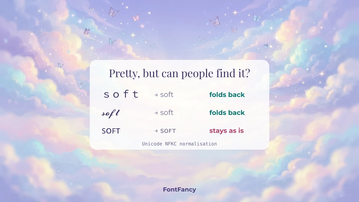
| Style | Example | After NFKC | UTF-16 length of “soft” |
|---|---|---|---|
| Plain | soft | soft | 4 |
| Fullwidth | soft | soft | 4 |
| Bold script | 𝓼𝓸𝓯𝓽 | soft | 8 |
| Small caps | ꜱᴏꜰᴛ | ꜱᴏꜰᴛ (unchanged) | 4 |
In practice: keep your real name in plain letters somewhere on the profile, and use small caps for decoration rather than the words people search for. The small caps guide explains which of those letters are real small capitals and which are borrowed. Screen readers also stumble over heavily decorated lines, so keep links and important details in normal text.
Looks change; letters do not. When a new style starts showing up everywhere, we add it to the trending text styles roundup, and rounder sticker-like letters live on the bubble text page.
Questions about aesthetic text
What is aesthetic text?
Aesthetic text is ordinary words rewritten in soft-looking Unicode styles — small caps, script, fullwidth — and paired with symbols and kaomoji that set a mood such as fairycore, coquette or Y2K. It is copy-and-paste text, not a downloadable font.
How do I make an aesthetic Instagram bio?
Pick one look, copy a letter style from the generator for your name, add two or three matching symbols, and write each line on its own row. Keep the whole bio under 150 characters, counting every symbol.
Which aesthetic font style is easiest to read?
Small caps and italic serif are the easiest to read on a phone. Script and fullwidth look softer but become hard to read in long sentences, so keep them for a name or a short phrase.
Do aesthetic symbols work in TikTok and Instagram names?
They work in display names and bios on both apps. The @username only accepts plain letters, numbers, dots and underscores, so symbols and styled letters are rejected there.
Why do some aesthetic symbols show as boxes?
The phone viewing the text has no font containing that character. Newer or rarer marks such as Linear B signs and some bows are the most likely to show as empty boxes on older devices; common ones like ☁︎ ♡ ✧ are safe.
Checked on 14 September 2026: normalisation and length figures computed with Python’s unicodedata module; fairycore trend reference from NSSG Club, 25 May 2026.